In most cases colour photography reveals the actuality and has the ability to communicate the subject more straightforwardly. It can appear to be more accurate, descriptive and informative with regard to how the subject matter is conveyed, especially when the colour used in the photograph matches the colour in reality. It is an undeniable fact that colour (or the absence of colour) plays a significant role in how we see and perceive things. Since we have to use our own imagination, experience and knowledge to see colour in black-and-white, we interpret things differently. According to Elliott Erwitt, “Color is descriptive. Black and white is interpretive.”
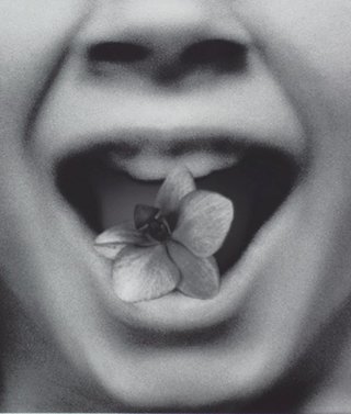
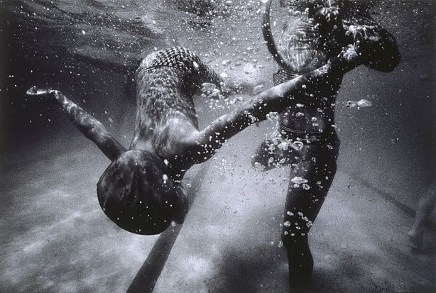
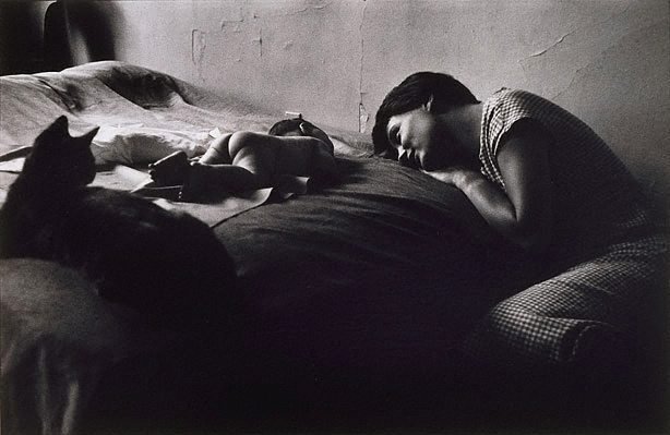
Human eyesight responds to brightness and differences in colours and is extremely sensitive to green, yellow and red. Without the use of colour, viewers are likely to focus more on the subject matter and its emotional state, making them pause to look closer and longer. Emotion may be conveyed by the weight of masses and the outlines, the vague composition of which might be unclear yet make their impact deeply felt; and this emotion is no intangible vagary but a strong objectivisation of reality.
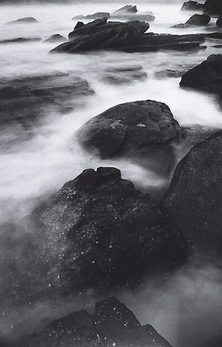
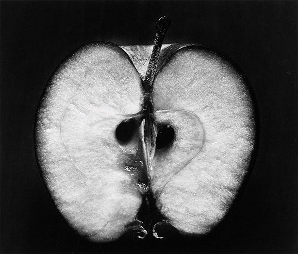
One of the most intricate problems photographers face is representing colours in shades of monochrome and tone that will suggest the original. While it certainly depends on the photographer whether or not he or she wants to imply the original colours or to obscure them, the shade of every colour is transformed and limited to black, white and gradations of grey. The density of light and shade and the reproduction of textures are among the most significant challenges in monochrome processes. Various strategies have been employed by a great number of photographers throughout decades to produce superb black-and-white images.