-
Details
- Date
- 1994-1995
- Media categories
- Sculpture , Assemblage
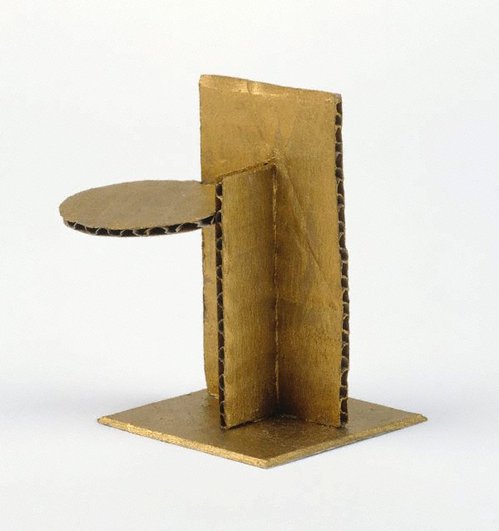
- Materials used
- match and staples box-parts, cardboard, paper, synthetic polymer paint
- Dimensions
-
installation dimensions variable
:
a - white box base with cross inside, 1.5 x 3.6 x 5.5 cm
b - white box base with black cone inside, 2.5 x 3.6 x 5.1 cm
c - savings brand box top with yellow oval and black circle, 2.2 x 3.6 x 5.1 cm
d - black box top, white box base with black cone inside, 3.4 x 5.6 x 5.6 cm
e - savings brand box top with horizontal bar -half black, 2.2 x 3.6 x 5.1 cm
f - maroon box top/ white box base with yellow and black cone, 2.9 x 5.1 x 5.6 cm
g - two storey box tops, 3.4 x 3.7 x 5.4 cm
h - yellow box top/ white box base with red cone inside, 3.9 x 5.1 x 5.1 cm
i - T shape construction - black horizontal stripe/ red and blue vertical stripes, 1.4 x 8.5 x 10 cm
j - black base with white and brown construction on top, 4 x 6 x 7.2 cm
k - brown base with white and brown construction on top, 3.1 x 5.1 x 7.2 cm
l - brown rectangular base with brown uprights, 4.3 x 3.8 x 7.7 cm
- Signature & date
Signed centre box top [C], ink "CARCHESIO" [C R IO in ink A CHES in type set]. Not dated.
- Credit
- Purchased 1995
- Location
- Not on display
- Accession number
- 182.1995.a-l
- Copyright
- © Eugene Carchesio
- Artist information
-
Eugene Carchesio
Works in the collection
- Share
-


-
About
After a short period as an architecture student and several years’ working with the railways, Eugene Carchesio took up art full time. His art embraces music, performance, installation, painting and sculpture, often combining all of these in an exhibition or event.
Carchesio talks about first seeing the work of Joseph Beuys in a 1979 Guggenheim museum retrospective catalogue.1 He was obviously astonished that art could take these many forms – spades in cases and bits of fat in corners (he believes the ‘Fat chair’ 1964, is one of the greatest sculptures ever made). Just before Carchesio decided to become a full-time artist, he called Beuys and spoke to him about his work. This call has become something of an urban myth in Brisbane but it under-lines the depth of the influence Beuys had on Carchesio’s development as an artist.
It was Beuys who gave Carchesio the idea of using titles as a way of introducing the complexity of text into his works, although Beuys was thinking along the same lines as Duchamp, who spoke of using titles as another colour on the palette. Like his two great precursors, Carchesio often uses titles in an ambiguous relation to the image. You could say they have no connection at all or you could suspect that they are part of the connectedness of everything (why did Duchamp label a snow shovel ‘In advance of a broken arm?’ Well it could just be another surreal juxtaposition of the unlikely but on the other hand it could set off trains of thought about snow skiing and broken arms – it all depends on the imaginative predisposition of the viewer). This is the key to such works; they encourage the viewer to take up the task of making the work where the artist left off. Some of Carchesio’s titles include ‘Berlin baroque’, ‘Silence is golden’, ‘European ghosts’ and ‘Museum of contemporary silence’. All of these could be suggestive of the source of the forms but they are playfully allusive rather than descriptive; they are part of the work.
Like John Nixon, Carchesio takes an arte povera view of materials. Many of his miniature sculptures are made out of used matchboxes – a metaphor of spent energy, which is another Beuysian reference turned on its head. Beuys used sulphur (the original material of match heads) as one of the energy materials in his sculpture.
In 1991 Carchesio took up a residency in Italy. It was a return to his cultural roots but it was not necessarily the great art that caught his attention. More particularly he was astonished by the peripheral details of friezes and the mosaics and decorative floor patterns found in palaces and churches across Italy. These patterns have provided a continuing language in his work; their details are an expression of the geometric order that the ancient Greeks believed structured the universe but they are also the expression of vernacular Italian culture in a way that the framed masterpiece never can be. Carchesio makes sure his own art remains humble in the same way, hoping perhaps to touch the universal by association.
1. Eugene Carchesio speaks with Alexandria McClintock, ‘Eyeline’, no 14, autumn 1991, pp 12–15
© Art Gallery of New South Wales Contemporary Collection Handbook, 2006
-
Exhibition history
Shown in 4 exhibitions
Kurt Schwitters acquisition and related works from the collection, Art Gallery of New South Wales, Sydney, 29 Nov 2004–17 Apr 2005
Someone's universe: the art of Eugene Carchesio, Queensland Art Gallery, South Brisbane, 25 Oct 2008–01 Feb 2009
Art of parts: collage and assemblage from the collection, Art Gallery of New South Wales, Sydney, 17 Sep 2016–13 Nov 2016
Australian art and the Russian avant-garde, Art Gallery of New South Wales, Sydney, 29 Jul 2017–29 Oct 2017
-
Bibliography
Referenced in 2 publications
-
Anthony Bond, Contemporary: Art Gallery of New South Wales Contemporary Collection, 'Objects and associations', pg.332-381, Sydney, 2006, 342, 343 (colour illus.).
-
Helen Campbell, Look, 'Stuck on you', pg. 16-19, Sydney, Sep 2016, 16.
-